
Harper prorogues Parliament again, this time until October
If a Prime Minister is scared to face Parliament, maybe he needs to find another line of work.
Let’s all help him at the earliest opportunity.
Category: Uncategorized
Danica, you're my hero!
 Top left: Danica with the first 4 boxes in our hall. Top right: one of the pastels. Middle: Pastel of Vancouver Chinatown celebration (1960s), Bottom: Our livingroom, filling up.
My jaw is on the floor and we have only opened one of the 5 boxes of Helen Andersen art that Danica packed in Victoria and shipped to Toronto.
Four of the boxes arrived today, in great shape. Canada Post muffed the postal code on the 5th box, so it will be along soon. No rush. There’s so much already here, I am staggered!
What the heck is a "sharrow'?

Automobile drivers are responsible for understanding the symbol, even if the meaning is graphically obscure. The marking indicates a sharrow, a lane that bicycles and motor vehicles are meant to share. In fact, the marking indicates the ideal place for a cyclist to ride in the shared lane.
In this photo, cyclists would be riding down the steep hill of Pottery Road, so cars should not be slowed too much by their road-sharing fellows. A cycle path on the other side of the cement barrier accommodates uphill cyclists.
A little colour in Helen's sketchbook
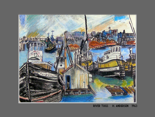
Done in Vancouver, B.C. in 1963, it was the only colourful pastel in a series of black marker drawings. Helen liked marine industrial subjects… industrial subjects in general. I think the jumble of activity appealed to her… the energy and the complexity of such scenes. She did a lot of work reflecting local conditions in those days… sawmills, working boats, wharfs, massive roots of driftwood. Vancouver’s grit, not its glamour.
Whose predictions were closer?
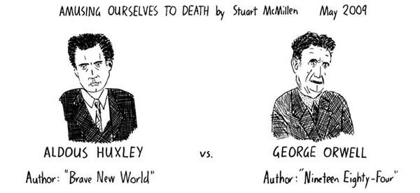
I StumbledUpon this excellent graphic strip only today, even though it’s been online for years. Does preference for one author’s vision over that of the other say something about your own world view?
Read the whole strip below and see. I’ll tell my preference at the bottom.
Taste of the Danforth: A good look
I knew that better shots than mine would be available! And in video, too, thanks to Peter Mykusz.
Why more prisons?
I wondered why Stephen Harper wants to build more prisons when the crime rate is in decline. Who’s he going to jail?
Today I hear that all of the members of the Canadian Senate will have their expense reports audited. Results that fail the sniff test are being turned over to the RCMP for investigation.
Who's this? question leads to Adenauer quote
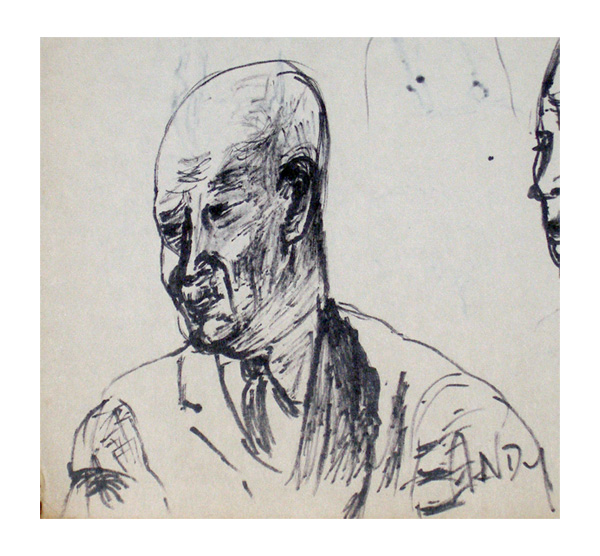
Sorry if my items are leaning a little heavily on art subjects these days, but that’s the way it has to be, as I rummage through the treasures of the “Ekland Find” of lost Helen Andersen art. Today I was wondering who was the subject of the sketch above, likely made while watching television. I thought perhaps Konrad Adenauer, Former Chancellor of post-war West Germany.
I went to compare images and found this lovely quote.
 As much as I like the quote, I’m not sure that it was Adenauer Helen was sketching. Maybe it was Eisenhower. Both were is the news at the time (1960). Or maybe it’s neither one of those. In any case, I like the sketch. It’s full of personality.
A Gordon Kit Thorne discovery
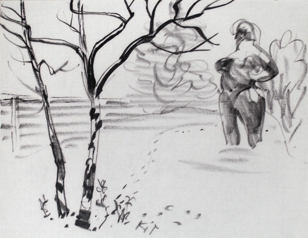
Inside one of my mother’s sketchbooks, I found 3 delightful little sketches by her friend and mentor Gordon “Kit” Thorne. All of them were of the same subject, composed differently. The paper looks like ordinary typing paper and the rendering was probably done with a refillable artist’s marker pen. He and Helen were both using such pens in those days.
This sketch is characteristically loose and sure, but it pleases me particularly because he recorded a monumental torso that I sculpted and stood in our back yard in Vancouver’s University area.
The sculpture was made of cheap, but fairly durable black cement over a wire armature. I never finished it and it’s long gone now, no doubt. Thanks to Kit, it survives in a modest way.
Art love
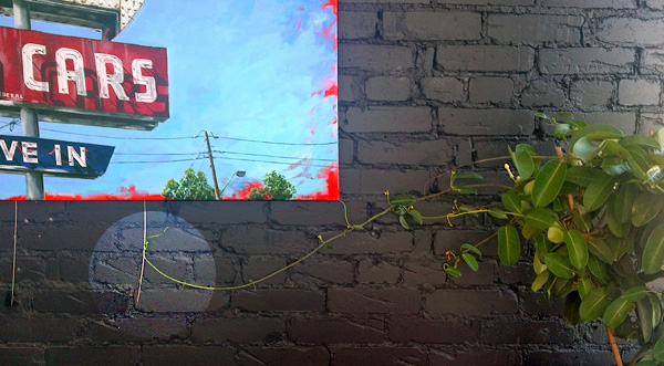
The plant in the window of the Flying Pony Café turns some of its attention away from the sun, reaching inward for one of proprietor/artist Andrew Horne’s photo realistic paintings of old neon signs. (Photo realistic except for the vivid red underpaint that the artist allows to show through.)